Beresheet
Beresheet is a Dead Sea salt and mineral cosmetics brand. Beresheet in Hebrew means “genesis”. The purpose of the brand is to provide “cosmetics for life”: it, just like all life, originated in the sea. This idea was reflected in the logo by moving from a subtle to a denser stroke: thus symbolizing the process of genesis.
In the packaging design, preference was given to minimalism: this created a calm, restrained brand character, much like the Dead Sea. The packaging also reflects the natural pattern of the Dead Sea salts through foil stamping, which at the same time resembles silver and the unevenness of salt deposits. This technique emphasizes the main ingredient of the product, its USP and the price category of the brand.
Beresheet Dead Sea
Packaging Design
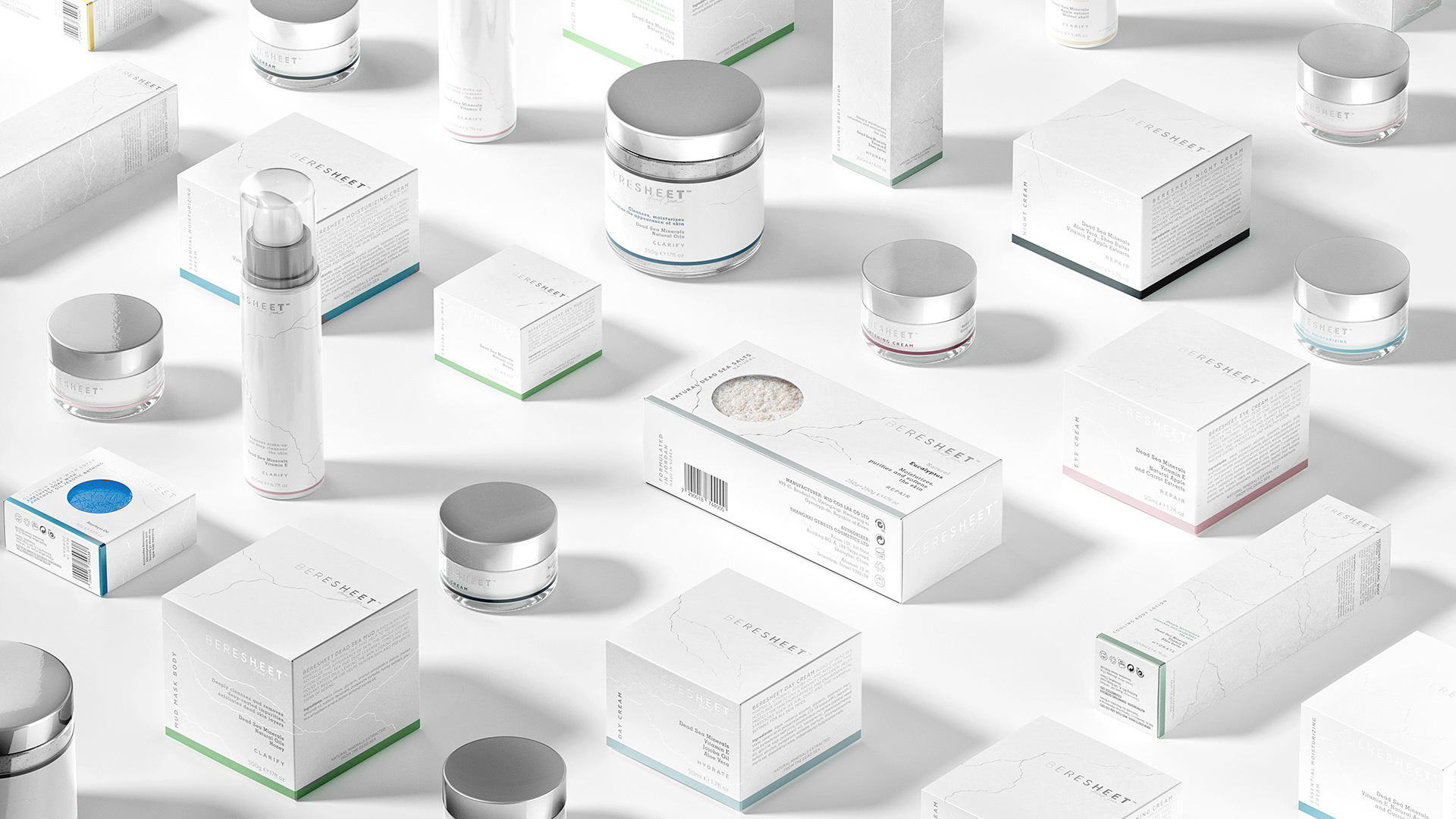

As a result of the project, 36 different SKUs were developed: salts, soaps, shampoos, creams, etc. The packaging is laconic and informative, which reflects the character of the natural cosmetics of the Beresheet brand.