Novalent Shield+
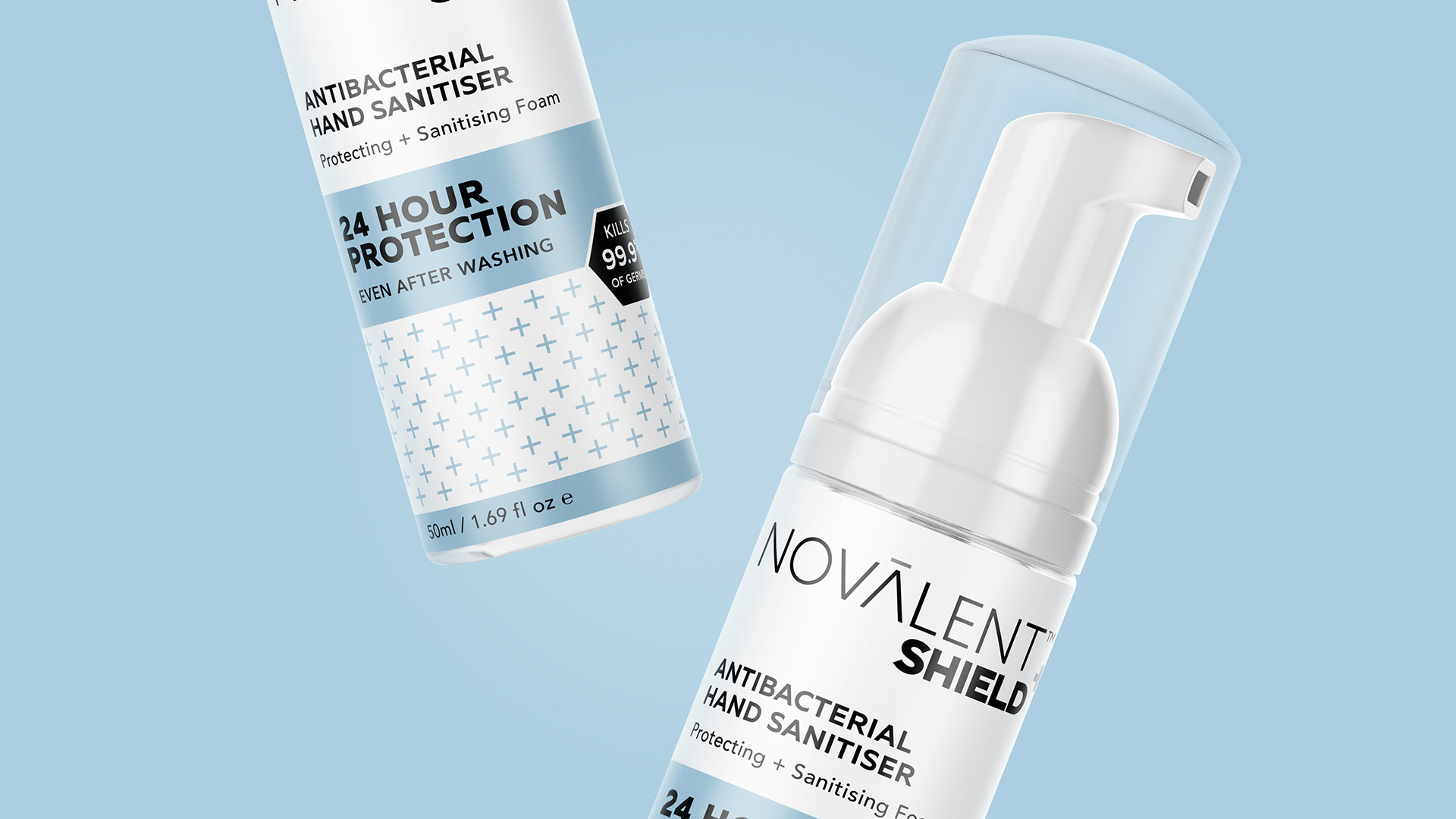
It is especially relevant in the United States, since there is an outbreak of COVID-19, so the PG team had to develop a design for this product as soon as possible. The PG team took the pattern of pluses as the basis for the design. Plus is symbol of the protective field in this case. Blue and white colors were also preferred, as both of them are associated with purity. Together these elements reflect the specifics of the product, which the consumer understands easily during a quick look.
Novalent
Packaging Design


