Visible
where needed
PW Krystian, a Polish manufacturer of protective and industrial workwear, is moving upmarket: a new, premium brand with stronger performance and bolder design. We built its identity from scratch — VARSA.
PW Krystian
Visual Brand Identity,
logo creation,
brandbook

Task
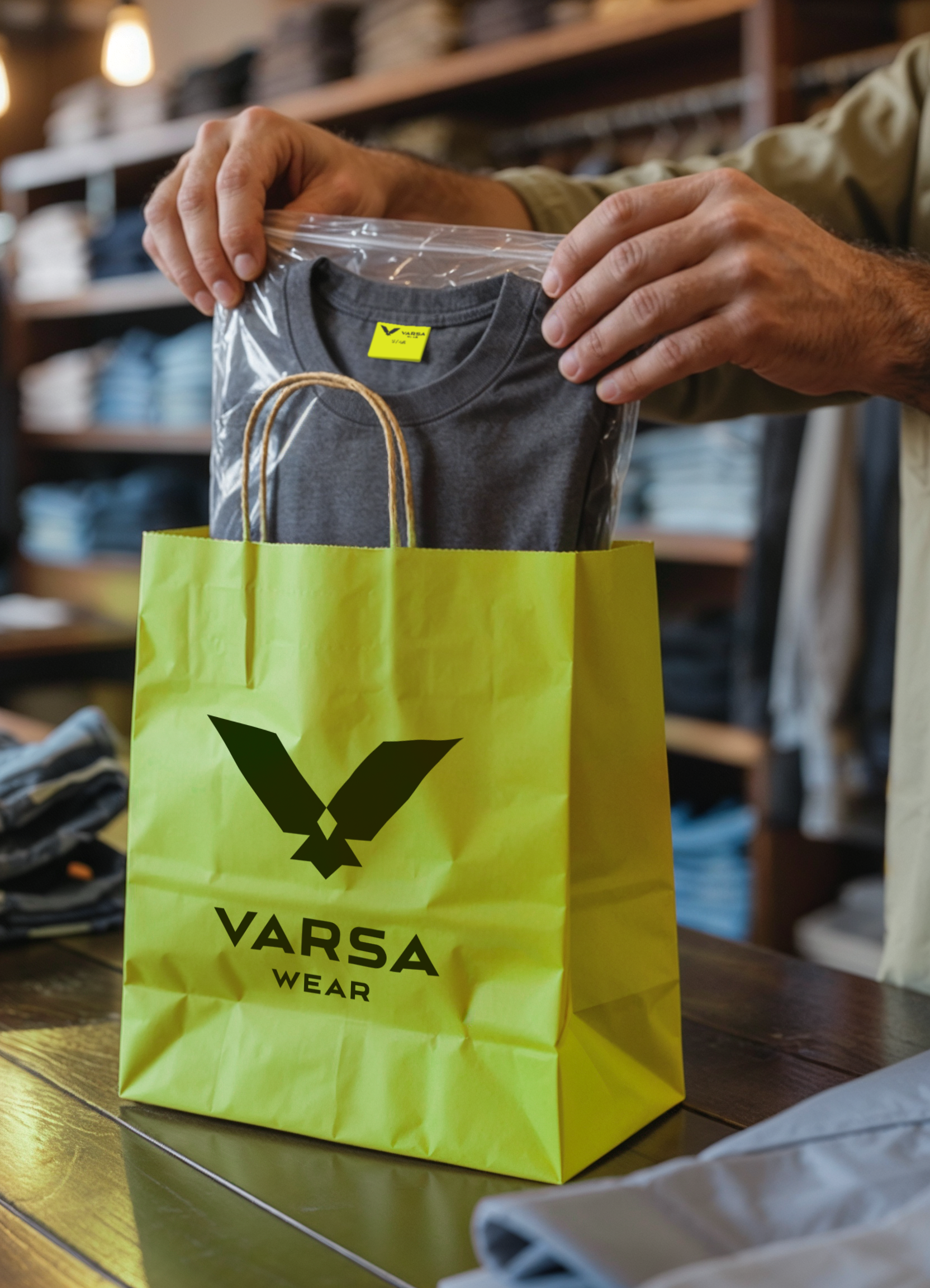
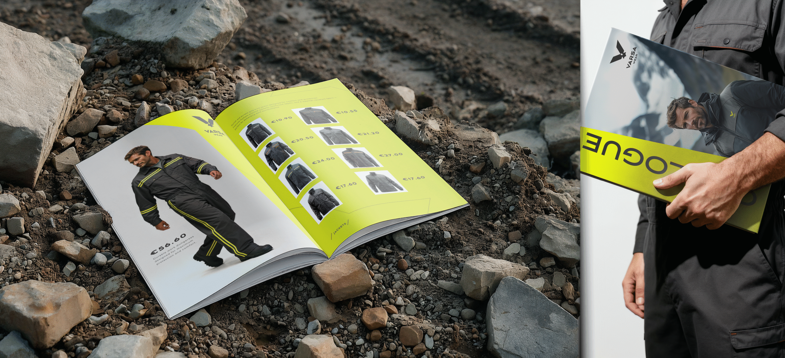
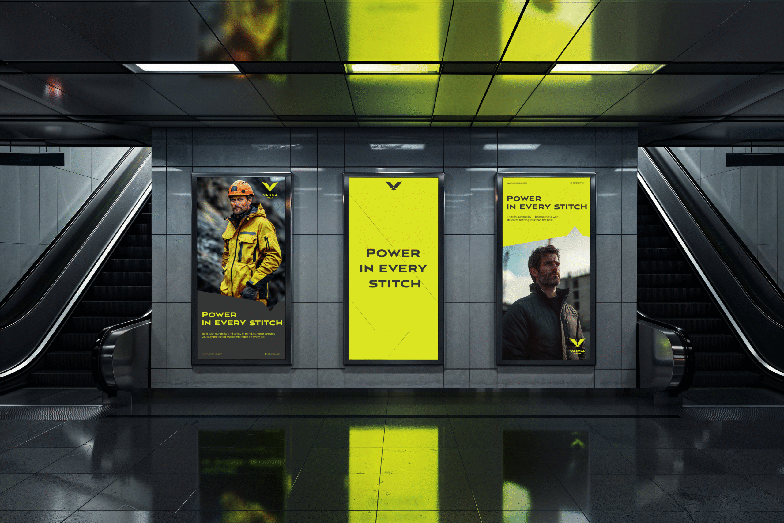
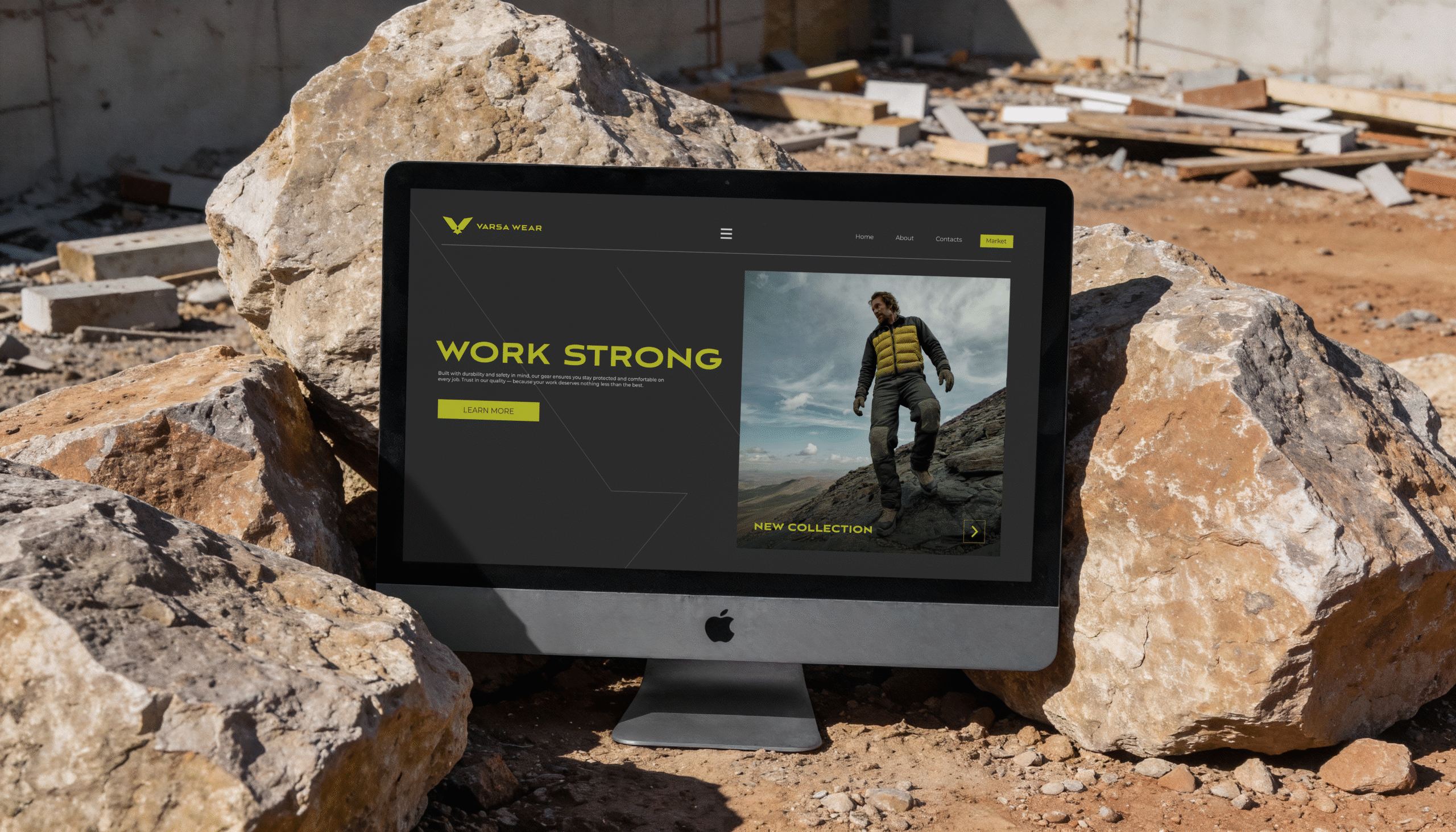
A complete visual identity for the VARSA brand: logotype, symbol, a colour range and a consistent brand experience — across product, labelling, packaging and communication.
Challenge
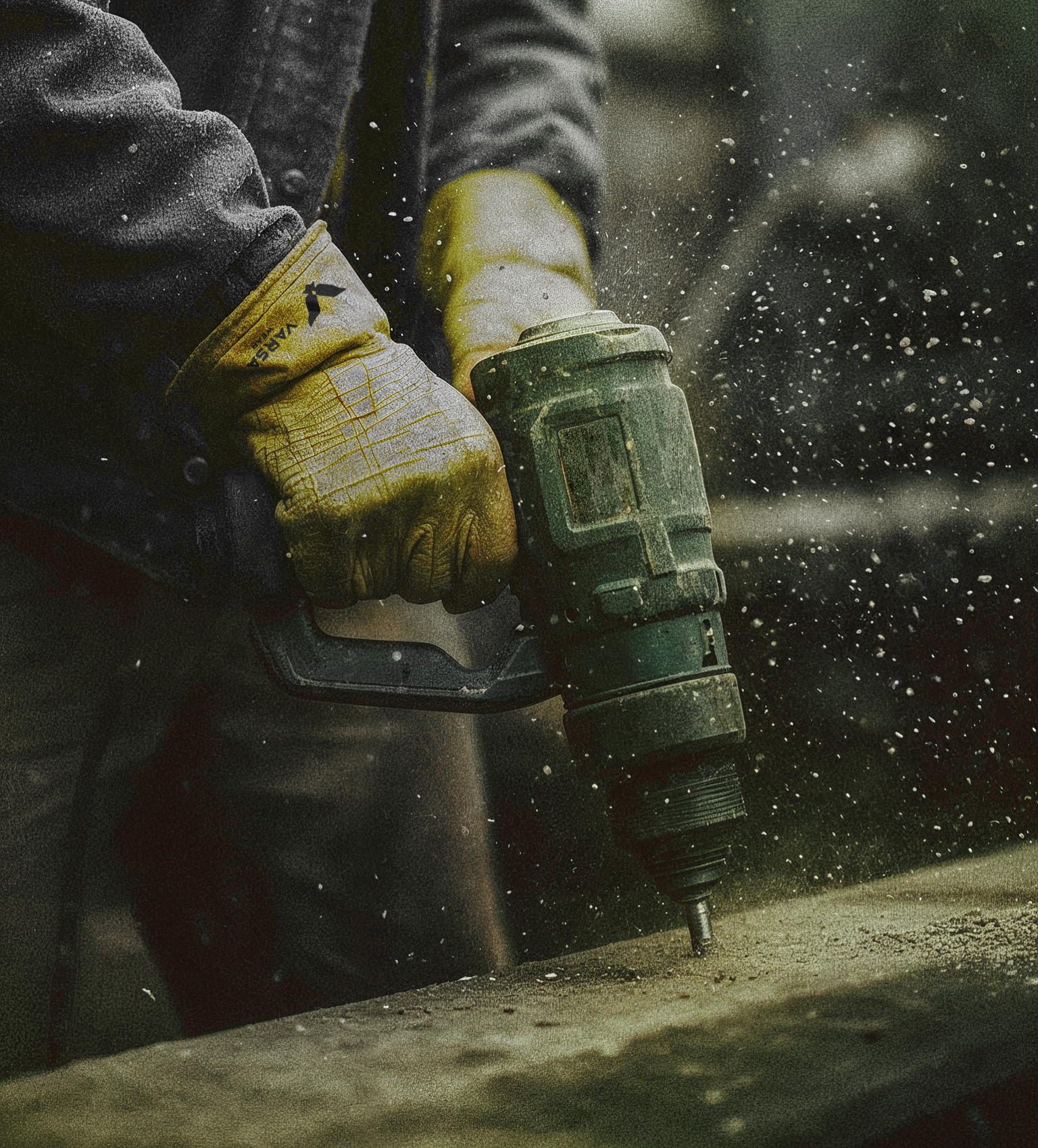
Clothing is usually judged in a well-lit shop or a catalogue. VARSA is judged on a construction site. On a moving person, in the rain, half-covered by a harness, under a layer of dust and mud. The identity had to survive embroidery, screen print, woven labels, heat transfer, reflective tape and a format the size of a fingernail — and still be recognisable from a distance.
But a VARSA customer’s day doesn’t end with the shift. The same clothing goes home with them, into a shop, to pick up the kids from school. So the brand had to work on two levels at once: protective where it needs to be, and stylish and versatile enough not to give away that it’s workwear.
Solution
One question decided everything: does it still read when it’s small, dirty, in motion and badly lit?
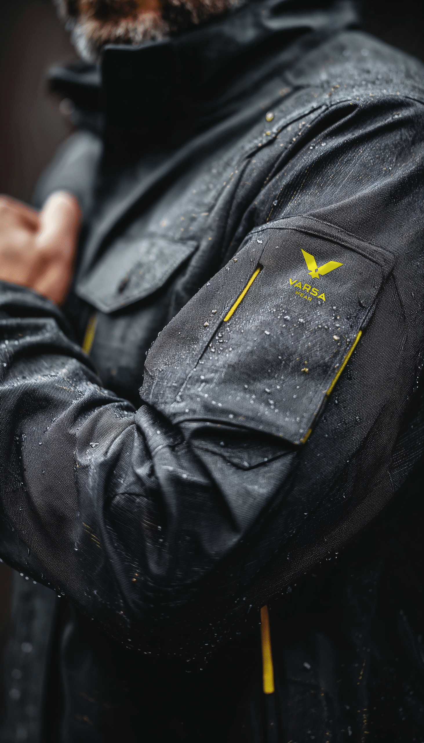
The logo — simple, geometric, built on a single grid. No gradients, no outlines, no details that die in the stitch. The eagle symbol is drawn from the same geometry as the letterforms: straight cuts, fixed angles, no ornament. A tight, disciplined silhouette — not a decorative crest, just a mark that works on its own, from a distance and under strain.
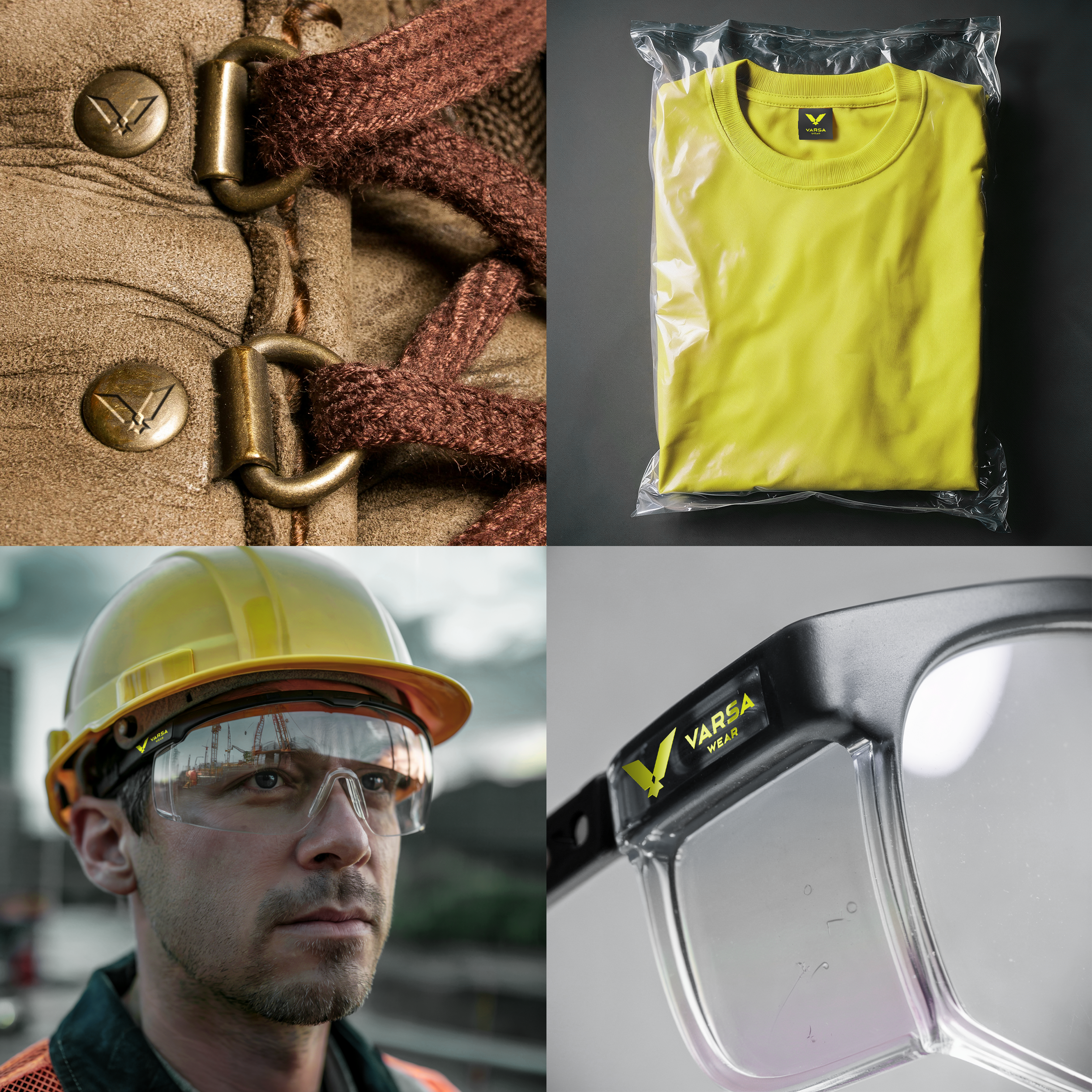
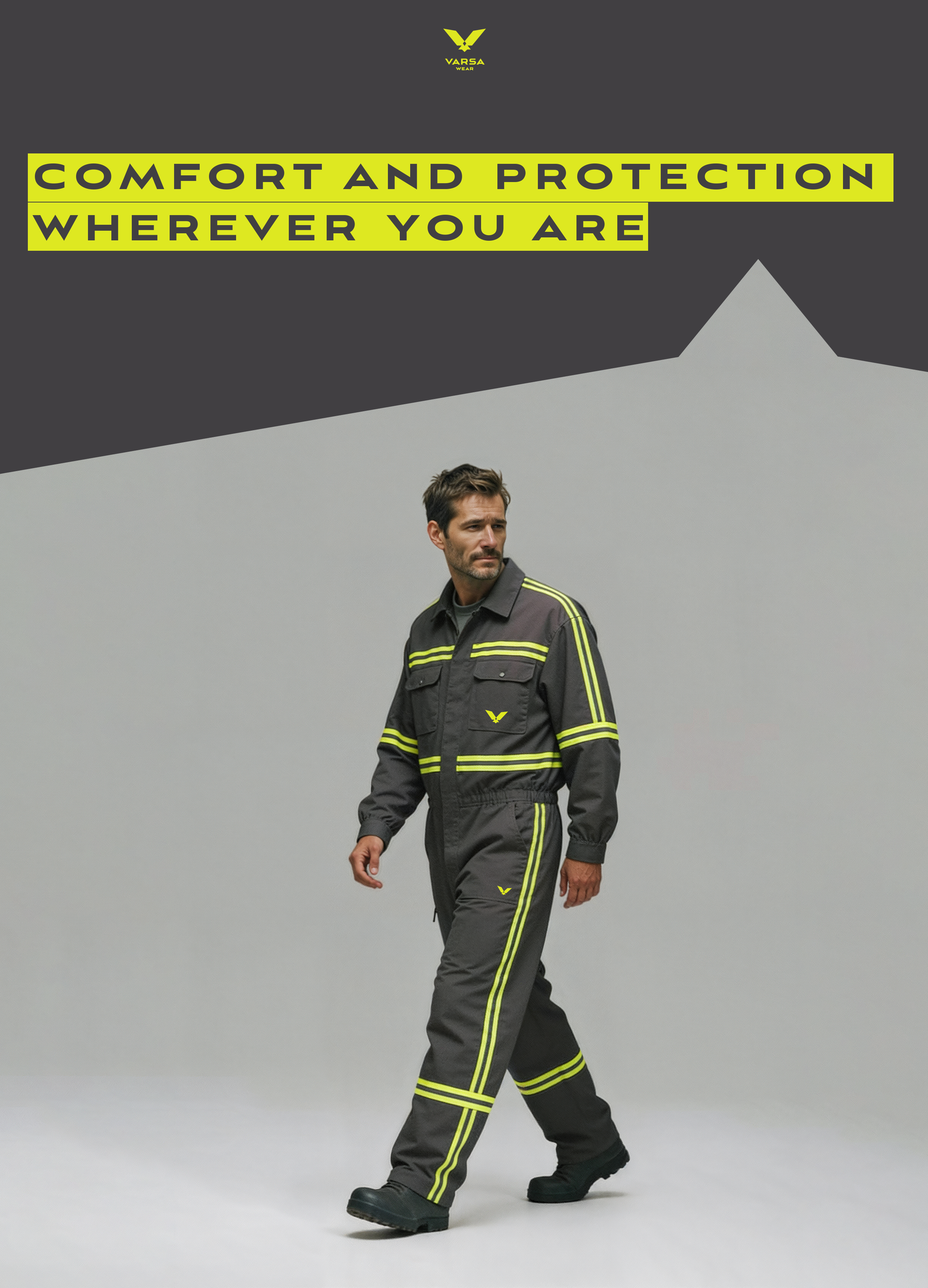
Colour: yellow on anthracite. The highest contrast the human eye can process — which is why it’s the standard for warning markings and protective equipment. Anthracite carries the structure and hides wear. Yellow does one thing — gets noticed.
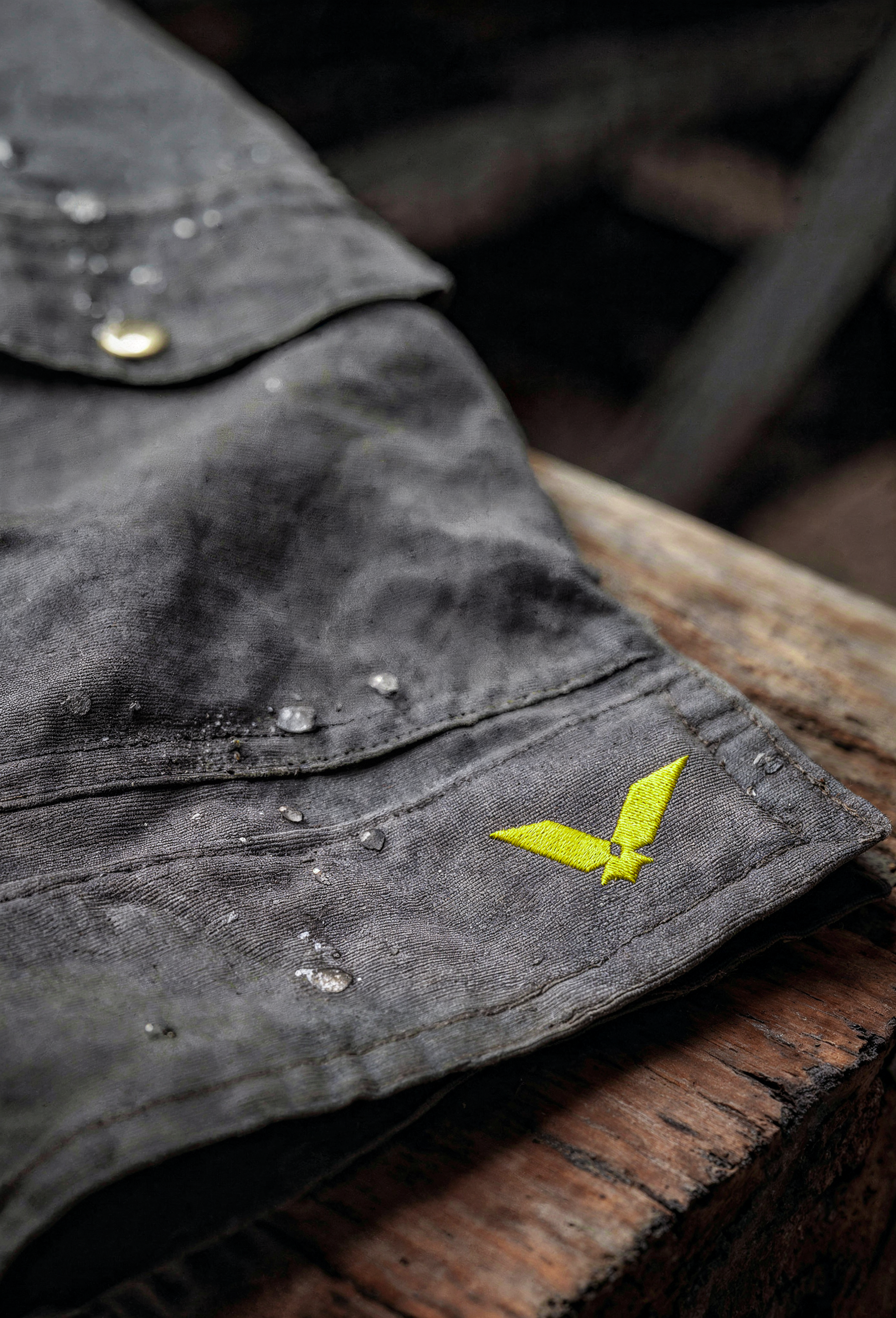
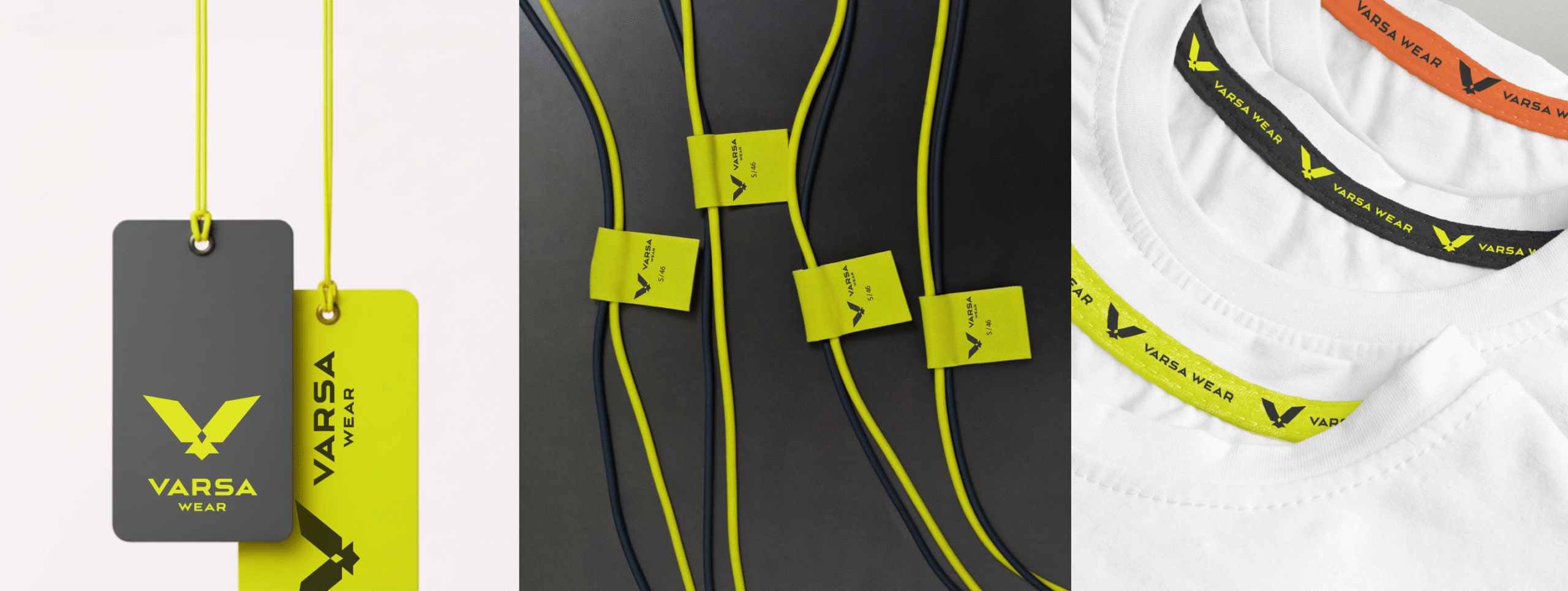
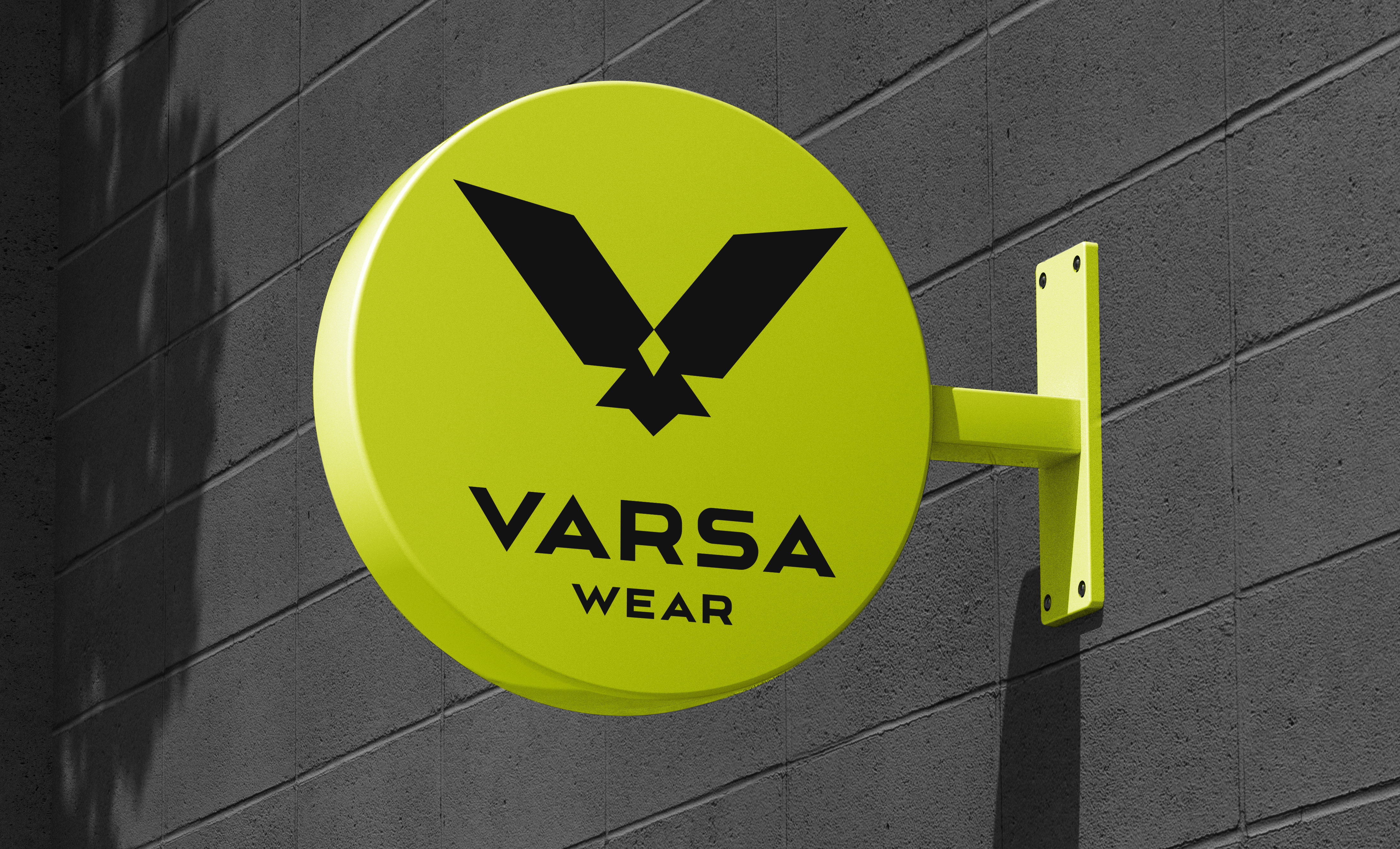
One geometry. One contrast rule. Across every surface. A brand that behaves like the product itself — consistent, tough and identical whether you meet it on site or on the school run.